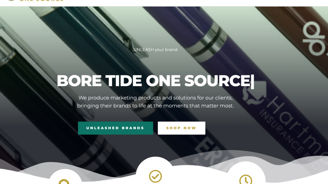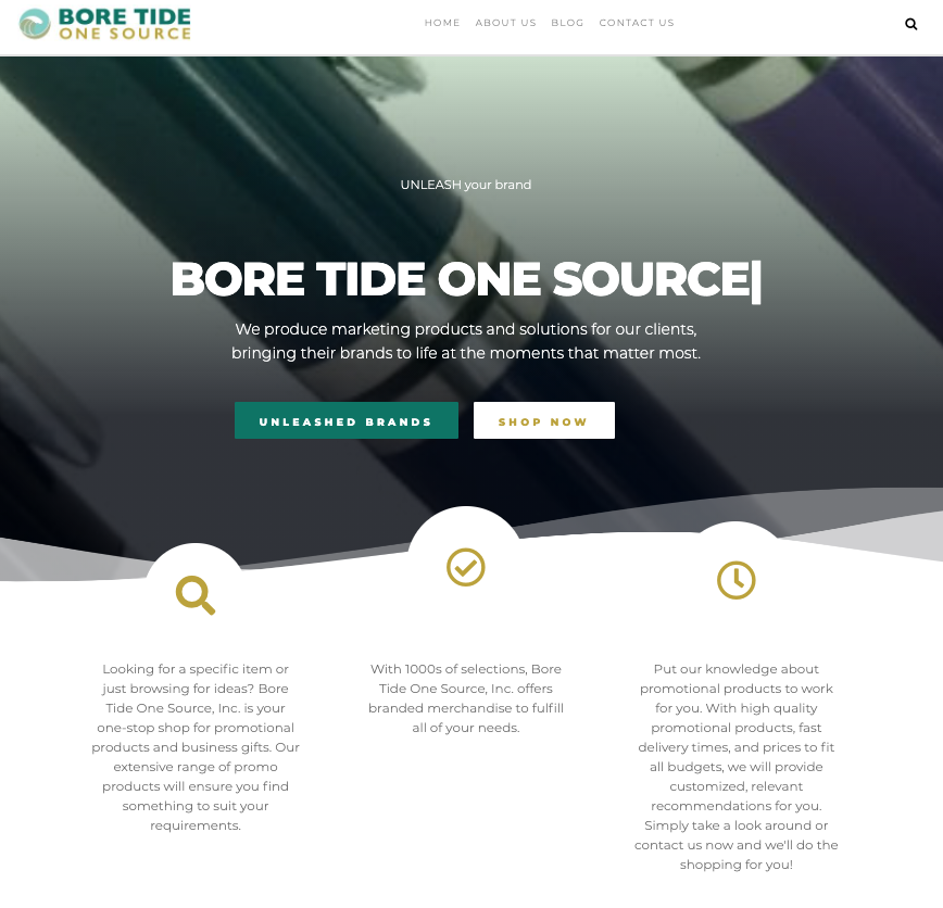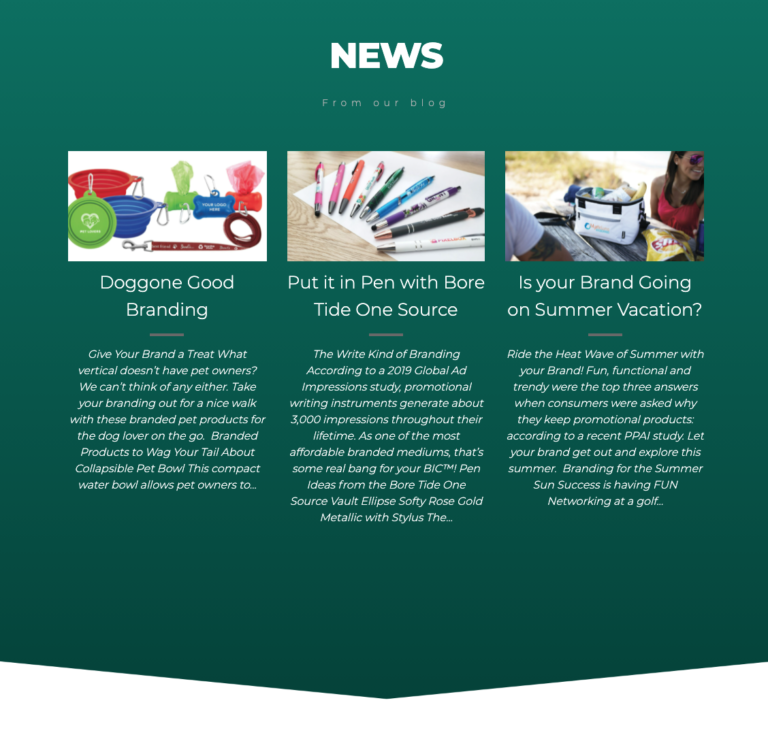
Ever since our conception in 2017, we’ve had the same website. As you can see now, our website has gotten a facelift!
We know how powerful—and vital—a digital presence is for any business trying to promote itself effectively in today’s marketplace. Even as a print, promotional and apparel production company this is true.
The truth is no business has any hope of promoting itself successfully without at least a website. There’s a lot more to be said about social media, advertising, and email marketing, but we’ll stick to what we know best
Why revamp the website now?
There were a few key factors that played into our website revamp happening in the second half of 2021; namely, it came down to necessity, resources, and strategic direction.
Before the revamp...

Necessity
As mentioned, you cannot be top-of-mind in today’s marketing world without somewhere digital to direct customers to. For many of us B2B businesses, that’s a website that lays it all clear.
If we can be honest for a second, our last website simply wasn’t doing the job any longer. Digital trends have changed—including many advocating not needing a website for your business—and consumer expectations have adapted alongside the growth of social media marketing and ad blockers. In order to capture attention, it was necessary that our website did so first.
Resources
The reality of 2020’s economic downturn left us strained for extra hands to get our client work done—much less our own. Since 2021, we’ve been slowly regenerating back to where we were pre-pandemic. With more minds helping with our internal marketing efforts, we have more resources to get the work done.
Strategic direction
No website is ready to relaunch without an understanding of how you’re going to relaunch and, more importantly, why. Without a strategic direction, no website launch or relaunch will see the return it’s expecting. With the help of Spawn Ideas, we were able to set clear boundaries around our marketing goals and how to accomplish those.
For us, strategic direction means:
- Understanding our brand promise and how we reflect that in our copywriting
- Reframing our website’s build in order to ensure ease of use
- Nailing down our brand feel, such as tone, colors, and imagery
Naturally, we started on the strategic direction long before even writing this blog post. This project has been multiple months in the making, and we’re excited to finally release it to you.
... After the revamp

What’s changed?
Armed with everything we needed to get started, we had all hands on deck to get the new site launched. Half of the work is getting the site built, the copy written, and the design finalized—the second half is making sure the old site doesn’t crash in the transition process!
If you’re reading this blog, though, that means we had a successful transition into our next chapter of digital presence. This website is only the beginning—here’s what we changed.

Mobile friendliness
What used to matter when it came to websites was how the pages looked and how the words spoke to the reader. While that’s still important, the expectations have shifted; more than ever, a user’s innate ability to use your site is of utmost importance. And for most of us, that means ensuring your website works on all devices—not just the common ones.
Our new website is flexible with any device you throw our way; Whether you use Apple, Android, tablets, a desktop computer, a gaming PC, a smartphone, or your Roku TV, you can reach us anytime from anywhere, 24/7.
Updated look
One of the first things you notice is also one of the most important: your first impression. For most of us, how a website looks is the first impression (and let’s be honest, our old website looked old.)
Keeping up with the times means more than just UI/UX, it means simply looking like you’re living in the 21st century. With our website’s facelift, we’re also bringing easier communications, faster page load speeds, and more information on the site than ever before. Keep in touch with all the changes we’re making. by using the contact form below.
Easy navigation
Speaking of User Experience (UX), our navigation is now simpler than ever before. Simpler for us means:
- Easier to understand
- Clearer fonts and page organization
- “Frozen” or “always within reach” menu bars
Updating our navigation was one of the most important parts of rebuilding this website, because we knew if the site was easy to navigate, it would be easier to find the information you’re looking for! And for the business owners looking into changing their own website, it also means users stay on it for a longer period of time.
What’s coming next?
This website relaunch is just the beginning of a long-term set of projects for Bore Tide One Source; we won’t spoil all the details now, but know that everything you see here will start to show up all over the internet.
Stay updated on all our future launches (and relaunches!) by following our email newsletter, Facebook Page, LinkedIn Page, and Instagram Account.
And, of course, if you ever need to reach us, you can email us directly at [email protected].